Contact Us

Use the form on the right to contact us.

You can edit the text in this area, and change where the contact form on the right submits to, by entering edit mode using the modes on the bottom right. 


123 Street Avenue, City Town, 99999

(123) 555-6789

email@address.com


You can set your address, phone number, email and site description in the settings tab.
Link to read me page with more information.

Blog

Filtering by Tag: AIA UK Tours;

Virtual Building Tour – Ombú by Foster + Partners

Fiona Mckay

Photo by Gregory Fonseca

The 2024 series of the AIA UK Chapter’s “Virtual Building Tours” convened on 20 June with a visit to Ombú, designed by Foster + Partners (F+P) and completed in 2022. The tour was given by Taba Rasti, Pablo Urango Lillo and Emilio Ortiz Zaforas all from Madrid, Spain. The team provided a historic context of the renovation of Ombú, a transformative office building built for the Spanish infrastructure and energy company, ACCIONA. This retrofit project breathes new life into a historical industrial building in the Spanish capital, creating a sustainable exemplar of building reuse and revitalising the surrounding area. The concept development was focused on the workplace well-being of building’s occupants and the construction methodology for the restoration of historic and structural elements of the building.

Foster + Partners’ retrofit of the abandoned warehouse created 10,000m2 of workspace.   On the surface, it qualifies as one of  the least Foster-like building ever encountered. However, once one scratches below the surface, the structure exemplifies how practitioners should approach the design and adaptive reuse of the plethora of dilapidated and unused buildings in our global cities.  F+P has not only breathed new life into the landmark building but  also developed a carbon neutral workplace, providing an exceptional example of sustainability in action.  

During the tour, F+P team explained how they ‘kept it simple’ by stripping the building bare, ‘cleaning and polishing it up’ and inserting a simple giant-tiered cake of staggered platforms, formed of glulam slabs and columns on a diagonal grid.  
Despite its abandonment, the building was in a relatively good condition, meaning the restoration was a simple, straight forward clean-up of the brick and existing metal roof.  Inside, the lightweight tiered structure introduced to maximise useable space is made from locally sourced timber.  Like a piece of handmade, custom furniture, the craftsmanship is a delight.  Due to the generous existing glass openings and central skylight flooding the interior with additional natural light, artificial lighting is minimal. As a bonus, the glass integrates photovoltaics to generate electricity.

The gardens are impressive, due to the team’s intent to provide "biophilic spaces" to maximise employees' well-being through the building's connectivity to the outdoors. Madrid's moderate climate enables use of the workspaces outside as well as inside, providing a flexible and healthy regime. A natural timber element is brought into the existing building, further enhancing wellbeing and improving productivity.  

The adaptive reuse of Ombú is a demonstration to what can be achieved in providing modern uses in older buildings, whilst being led by responsible carbon neutral design.

The AIA UK Chapter continues to host its building tour series for the 2024 season based on Winners of AIA UK 2023 Excellence in Design Awards. The series offers architects the opportunity to visit notable buildings that have particular design interests in the UK and abroad. Follow this link HERE for further information to participate in the next tour of Saltmarsh House by Niall McLaughlin on 12 September 2024.

Written by Gregory Fonseca, AIA

Print Friendly and PDF

Building Tour - UCL East Marshgate with Stanton Williams

Fiona Mckay

Photo by Gregory Fonseca

The 2024 series of the AIA UK Chapter’s “Building Tours” continued on 30th May with a visit to UCL East Marshgate, designed by Stanton Williams, completed in 2023. Despite Stratford Station having been closed due to an incident with a train, a good audience managed to convene for a building tour led by Gavin Henderson and Ali Abbas, both from Stanton Williams.  The building is 35,000m2 of new class space within an academic building centred at the heart of UCL East, which is the largest single expansion of University College London since it’s beginnings some 200 years ago.

As you approach the building from a distance, it has a civic presence. Currently, the other four proposed buildings in the masterplan have not yet been built, lending the building to be perceived as an “object building” within the landscape.  According to Stanton Williams, Marshgate is “designed to create a collaborative and cross-disciplinary educational environment focused on finding solutions to today’s biggest social, environmental, and technological challenges, drawing on the shared knowledge and expertise of the many faculties that will converge at the new East London campus.” 

We began the tour on the south side of the building, on the site where two further buildings are planned to be constructed, where our hosts explained the project’s material considerations. The building consists of eight stories, however, the design breaks-up the mass vertically to read as four main elements - the ground-level base with three further and distinct divisions of the mass and articulation of the facades.  Our hosts explained that Marshgate is built to echo the solidity and permanence of UCL’s original Bloomsbury campus. Its massing reflects the site’s industrial past, while responding to the sculptural quality of the adjacent Olympic structures. The sculptural form of the building is crafted with in-situ and precast concrete panels with its subtly graded tones and textures appearing to grow out of the ground, reaching towards to the sky.  The facades showcase in-situ, timber board-faced concrete on the lower floors and upper levels are shaped to enhance natural daylight and ventilation while the texture of the precast elements appear to get smoother, further defining the vertical divisions of the massing. There are additional minimalist accents of Corten steel cladding that define protruding architectural elements, announcing a point of entry.

During the tour, Henderson remarked on some of the history and the dialogue held with planners, with those negotiations having led to the civic and community-oriented solution at the ground plane. This project puts inclusion, health and well-being of the general public on par of importance with private interests by allowing public use and permeability on all four sides of the building.  This ethos, in fact, is becoming increasingly a necessity in city environments by “making spaces and places in urban centres for people” within non-public buildings. The ground level includes a network of publicly accessible spaces, including a café, public art displays, and activities designed to draw community organizations, schools, and the public into the “heart” of the building.

Photo by Gregory Fonseca

The internal public space is punctuated by a central, day-lit atrium that is naturally ventilated and vertically connects all the building’s activities. Its visible circulation routes include stairs and escalators, which in the words of our hosts, were designed with the intention to create further opportunities for “random encounters”. The programmed spaces include design studios, labs, lecture theatres, fabrication workshops, media studios, exhibition areas, a library, and a professor’s lounge. There are additional spaces throughout for collaboration and engagement with local businesses and communities which form a part of the civic aspect of the design.

The palette of materials is simple which adds to the elegance of the solution and includes in-situ architectural concrete, timber and powder-coated steel.  The curation of art throughout also plays a fundamental part of the ethos and the spirit of UCL East Marshgate.  From the sculpture of the globe, hanging in the main atria space, to the variety and scale of art displayed throughout, all assist in providing a sense of place for this multi-use university building. Given Marshgate’s design, public access, multiplicity of learning environments and collaboration spaces and elegant curation, UCL East Marshgate is an exemplar of the future of higher learning and civic architecture.

The AIA UK Chapter continues to host its building tour series for the 2024 season based on Winners of AIA UK 2023 Excellence in Design Awards. The series offers architects the opportunity to visit notable buildings that have particular design interests in the UK and abroad. Follow this link HERE for further information to participate in the next tour of Saltmarsh House by Niall McLaughlin on 12 September 2024.

Written by Gregory Fonseca, AIA

Print Friendly and PDF

Building Tour - Tower Hamlets Town Hall with AHMM

Fiona Mckay

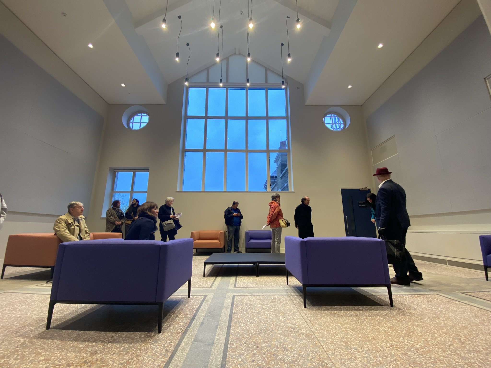
Interior photograph of the Tower Hamlets Town Hall. Photo by AHMM.

The AIA UK building tour at Tower Hamlets Town Hall was an engaging event, attracting a total of 22 attendees. Walking through the Grade II listed former Royal London Hospital building was like a step back in time, while the £124.7m modern re-imagining of the space into a town hall remained rooted in a contemporary Central-East London atmosphere. The Georgian facades stood as stoic witnesses to centuries of change, while the modern extension offered a glimpse into Tower Hamlets' aspirations for the future of municipal governance.

Two tour groups were led by AHMM architects Eleonora Gallenzi and Ben Leach, exploring both the interior and exterior of the building. The guides highlighted the palimpsest of old, older, and brand-new features that occasionally created unique design challenges. A notable example was adapting the surrounding site to allow for multiple points of step-free access and integrating the previously quarantined hospital complex with the surrounding public walkways. In general, the AHMM renovation adopted a highly practical and cost-effective approach, but also exhibited architectonic creativity and innovation alongside a bold colour scheme of reds and blues.

The AIA UK tour groups crossing paths while walking through the intermediate ramped hallway, located between the extension and the old building. This open hallway articulates the existing façade (left) alongside a multi-story height, linear artificial accent lighting, and a roof skylight overhead. Photo by Adelina Koleva, AIA.

Questions were raised particularly about the history of the original building and extensions, as well as the choice of colour schemes. The vibrant red theme on the ground floor sparked intrigue among the guests – Gallenzi explained that the red emerged from the original brickwork while the blue wayfinding hues were sourced from the original terrazzo flooring on the second floor. These details tell intelligent stories of the past, not only adding to the historic theme of the tour but enhancing the value of the modern upgrade to an oftentimes conservative and discerning public.

A refurbished part of the old building on an upper floor, repurposed as an office break-out space. Note the original terrazzo flooring, one of the key historic features which provided the architects with colour inspiration for the renovation. Photo by Adelina Koleva, AIA.

At ground level, the council chamber serves as a pillar not only of democracy – but also of accessibility and flexibility. These principles were reflected in the wheelchair route to the chamber floor and the integrated storage units along the walls. The former hospital building might not have originally been intended for such purposes, but the architects aimed to provide these amenities to improve both public engagement and customer service on behalf of their client.

As the tour concluded, guests parted ways with a newfound knowledge and appreciation for AHMM’s Tower Hamlets Town Hall – as well as some well-earned continuing education credits! Thank you to everyone who participated in the exploration, and special thanks to Etain Fitzpatrick and Gregory Fonseca for organising this event, and our tour guides from AHMM for sharing the building with us. The AIA UK looks forward to welcoming more architectural enthusiasts on our future Building Tours.

Written by Adelina Koleva, AIA

Print Friendly and PDF

AIA Members Attend London Art Fair

Fiona Mckay

19 January 2024

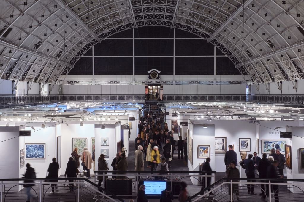
Our friends at the London Art Fair invited AIA UK members to the annual mega art event held at The Business Design Centre in Islington.  The Fair took place from the 16th of January through the 21st.  The London Art Fair connects the best art galleries from around the world with seasoned and aspiring collectors.  Over 120 galleries were in attendance and there was a full programme of talks and tours.

The Fair was an impressive sight and was teaming with visitors.  There was a wide variety of art on display, all for sale with a broad rage of prices to suit everyone’s budget.  It was a very enjoyable evening help in part by the free glasses of Bubbly!

The Fair was founded 36 years ago with the aim of showcasing Modern and Contemporary art.  The Fair has grown steadily over the years and now, is an important event in the global world of art.  Over 25,000 visitors attended last year.

As this is an annual event, we hope to be invited back and to see you there in 2025!

Print Friendly and PDF

US Embassy Tour

Fiona Mckay

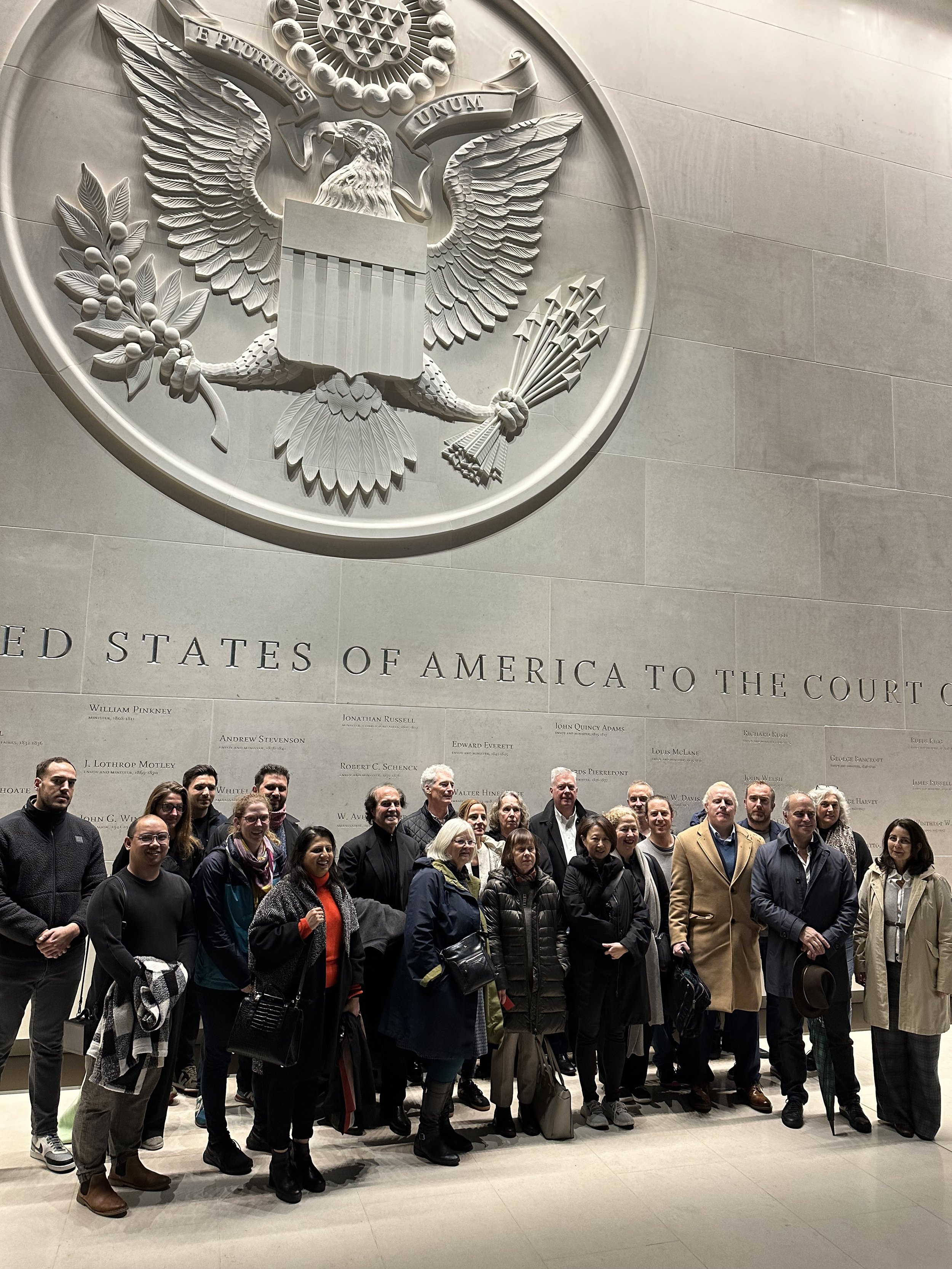
AIA Members in the Ground Floor Consular Lobby below the Great Seal of the United States of America 

On 16 Nov 2023, the US Embassy hosted the AIA UK in a private tour of their latest home in Nine Elms, Battersea.  There has been an official American presence in London since John Adams, the first US minister, in 1785.  Since then, the US “Embassy” -  or more properly referred to as a “Legation” in the early days of this long standing international relationship - has had a variety of homes in London, including Great Cumberland PlacePiccadilly; 98 Portland Place; and 123 Victoria Street in Westminster.  

In 1938, the Embassy was moved to 1 Grosvenor Square.  The next Embassy was designed by Finnish Americanmodernist architect Eero Saarinen, and constructed in the late 1950s at the same Grosvenor location.  This is the facility that many of us still relate to, having likely visited the iconic building in the past to renew passports and conduct other business as US citizens. It is now listed and is being converted into a luxury hotel. The latest Embassy, designed by KieranTimberlake, is no longer in well-established Mayfair but sits prominently in up-and-coming Nine Elms, overlooking the Thames

The Architect received the commission to design the new Embassy and surrounding water and green spaces via a competition.  Through the combination of the 100-foot set-back from the road and a series of water features, the site meets the State Department’s stringent security requirements at the same time it provides a fitting backdrop for a stately object building.  

The cube-shaped building has a laminated glazing envelop with a transparent framework of ETFE on three sides, giving a textured 3D effect against a tightly wrapped glazed wall system. The ETFE on the east, west and south facing facades controls excessive solar gain and mitigates glare. This allows daylight throughout the building, while reducing the energy required to cool and light it.

I admit I was initially sceptical of the move to Nine Elms; however, having had the opportunity to tour the new Embassy I am now delighted with the result.  On the evening of the tour, I approached the building from the northeast corner of the site, passing along curving pathways in the landscaped gardens to see the main building set on a large plinth above a protective pool.

Garden approach to the US Embassy London

Joining other waiting AIA visitors, we entered the Embassy through a pavilion on the eastern side into the main lobby where we were greeted by a large two storey space with a beautifully crafted US seal embossed on a limestone feature wall along with the engraved names of all previous ambassadors. We were then led through to the gallery, grand staircase, and events hall below.  

From the events hall, we were able to tour the “belly” of the Embassy and explore the mechanical spaces of the building, which boasts LEED Gold and BREAM Outstanding ratings. We were then escorted via a series of lifts to the functional parts of the Embassy where “processing facilities” allow citizens to renew passports and other government business. Here, the spaces and finishes were carefully detailed and crafted, offering an environment a far cry from the mere functionality the Grosvenor Square facility.  

The Embassy - with its emphasis on artwork and greenery - offers more than just traditional office interiors.  Art plays a significant role in the overall presentation of the Embassy with a total of 19 major pieces. One hanging sculpture, which occupies the entirety of the Embassy’s gallery atrium, is a three-storey structure comprised of 32 ten-foot square panels. A mural entitled “We the People” includes fragments and full articles quoted from the U.S. Constitution. Each of the interior gardens is inspired by a different region of the United States, including the Canyon Lands, the Gulf Coast, the Midwest, the Potomac River Valley, the Pacific Forest, and the Mid-Atlantic Region.  

Upon completion of the tour, the AIA guests were fortunate to partake of refreshments in the “Embassy Bar/ Restaurant”, enjoying a beverage while admiring stunning views of the London skyline north of the Thames. It is also noteworthy that American Embassy in London was funded entirely from proceeds of the sale of other U.S. government property in London. 

The tour was hugely impressive, an evening to remember!

Written by Gregory Fonseca, AIA

Print Friendly and PDF